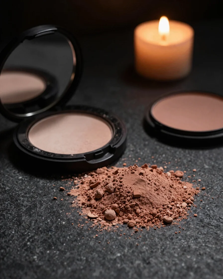
The Envoûterre view
Beauty found in shadow
We see beauty as something best met after dark, where pigment, texture, and quiet ritual can be felt more than glimpsed.
Design philosophy
A nocturnal alternative to bright beauty retail
Most beauty shelves are lit like laboratories. We chose the opposite: low light, deep surfaces, and a considered pace that lets each shade and finish register.
Our collection is built around pigment density and moody undertones, from velvety depths to satin highlights. Each formula is chosen for how it sits on the skin and how it looks by candlelight.
Compact design follows the same logic. Every case is meant to feel weighted and tactile in the hand, so the ritual of opening it becomes part of the pleasure.
The craft
Made for deliberate evenings
Packaging is designed with considered weight and deep, matte tones so each piece feels intentional before it is ever opened. The visual language stays low key throughout.
Pigments are chosen for richness and depth, applied in low-light moments where texture and shade can be appreciated slowly and with care.